

Kanban boards
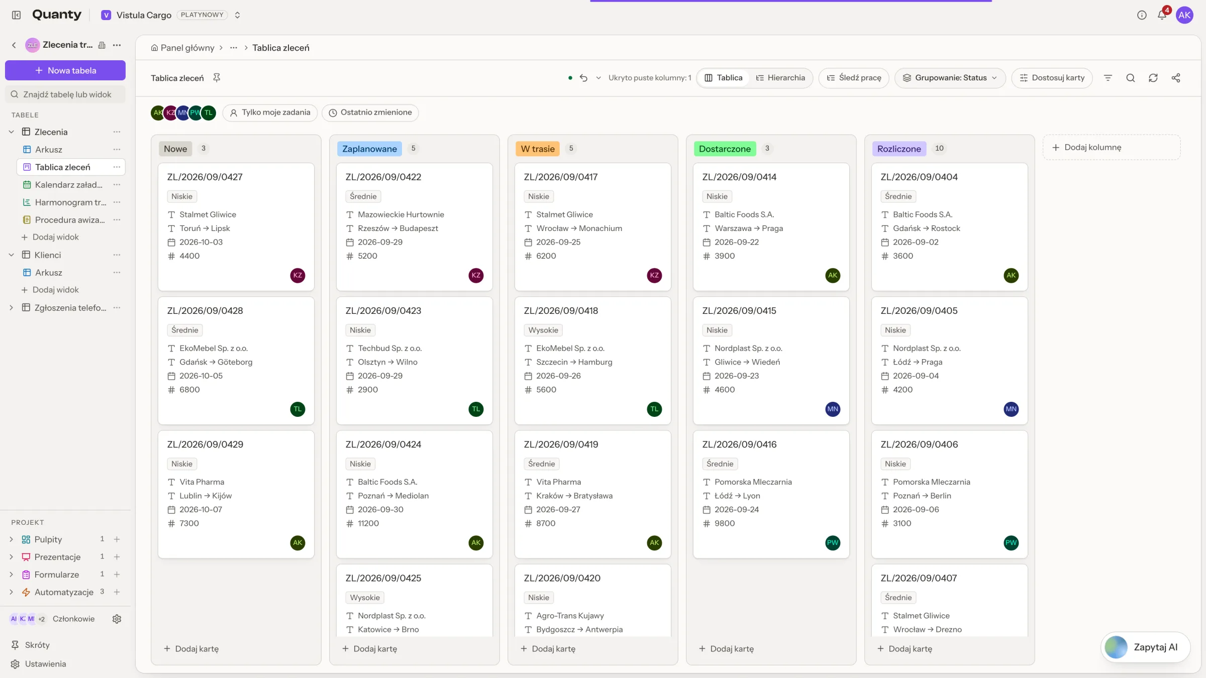
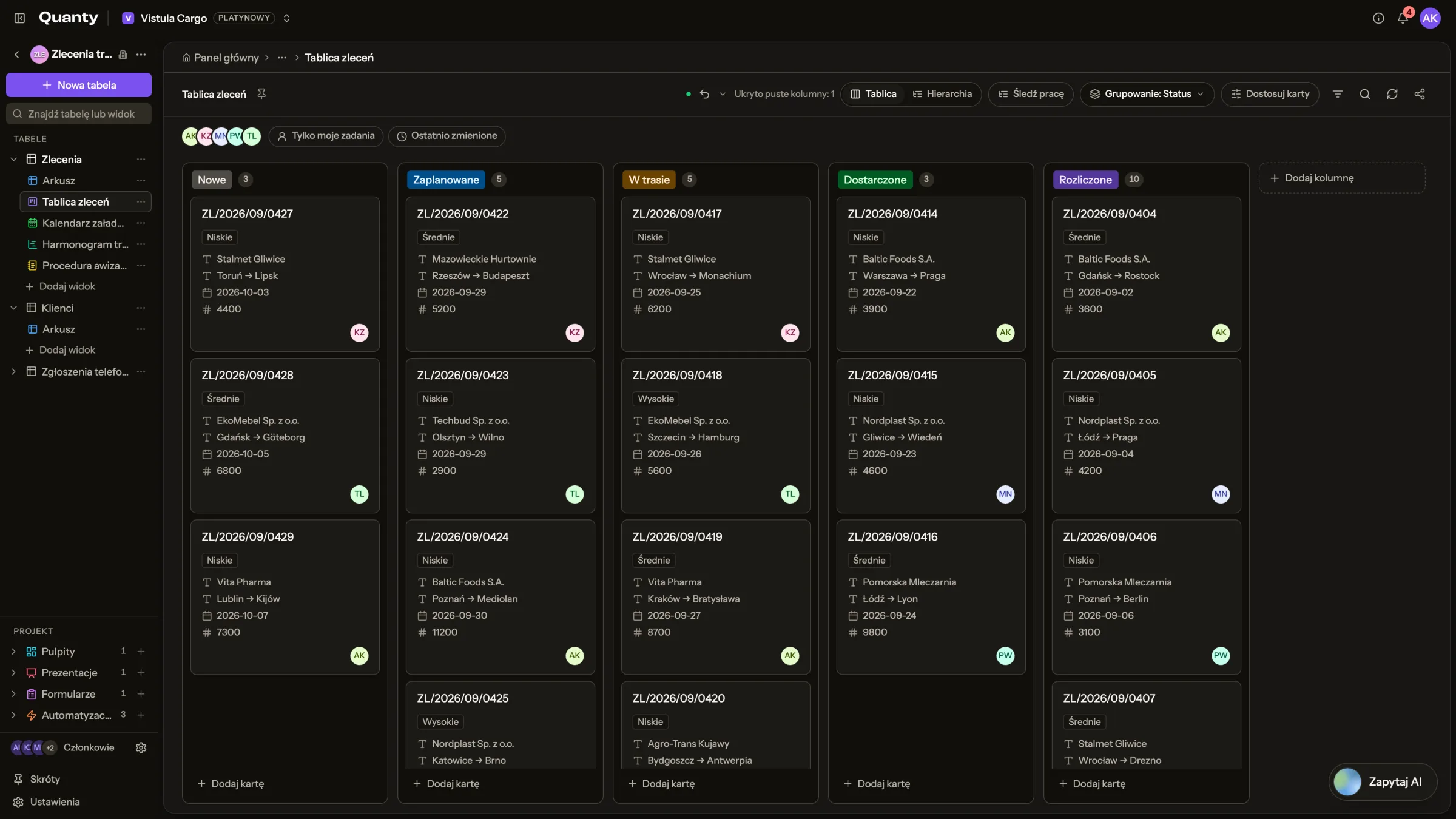
A board is a live kanban view over one sheet — every card is a real row, grouped into lanes by a select column. Dragging a card into another lane writes the underlying cell through the same path as a manual edit, so the change lands in the audit trail and downstream columns know they went stale. Nothing is copied: the board always shows the table as it is, and Refresh from the table pulls in the latest rows on demand. A board can also track work items: keys such as KAN-64, types, priorities, parents and blockers on every card.
Creating a board
From a workbook's sidebar or from a project space, choose New Kanban board: pick a Source table and a Stack by column. Any single select, multi select or classification column works — "each option becomes a lane". In a project space a board can also sit on a folder; you then pick the source sheet from anywhere underneath it.
Creation is instant and deterministic — no AI is involved: the column's options simply become the lanes. The default title joins the sheet and the stack column — "Deals · Stage" — and you can later change the title and description, pick the Card title column and choose the card fields.
If the table has no key column yet, the same dialog asks for a Key prefix and offers Track as work items (type, priority, parent, blockers). It suggests a prefix from the table's name, and it is set once: "the prefix cannot be changed later, so keys people share keep working". A table that already has keys shows them read-only. Work items explains the prefix and every field it adds.
Lanes
Lanes always mirror the stack column's live options, reconciled on every read:
- Uncategorized — rows with no value gather in an implicit lane pinned first.
- Add lane appends a new option to the select column. A board holds up to 30 lanes.
- Rename column in the lane's Column options menu rewrites the option — and every cell that used it.
- Delete column removes the option; its cards survive and move to Uncategorized.
- Drag lane headers to reorder, or use Collapse lane to shrink one to a slim bar — both persist, and a collapsed lane still accepts drops.
- Click a lane's name, or choose Change color in its menu, to pick one of 18 colours. The colour belongs to the option itself, so the table's chips change with it.
- Hide empty stacks removes lanes with no cards from view; the board header counts how many are hidden.
Cards
- Drag a card between lanes to change its cell. On a multi-select board a card appears in every lane its values name.
- The order you arrange cards in within a lane persists.
- Add card at the bottom of a lane creates a real row with the lane's value pre-filled and opens it right away.
- Customize cards picks the title column and up to 8 card fields — by default the sheet's first three columns.
- On a board that tracks work items, each card also shows its type icon and key, its priority, its parent, how many of its children are done, a "Blocked by" badge, its labels, a flag and its due date, which turns into "Overdue since" once the date has passed. These are drawn by work tracking, so they do not take up the 8 card fields.
The card menu
Open a card's ⋯ menu, or right-click the card:
- Open work item, Move work item (Top of column, Move up, Move down, Bottom of column) and Change status.
- Copy link copies a link that opens the record, and Copy key copies the key alone.
- Link work item with Blocks… and Is blocked by…, and Change parent.
- Select cover paints a colour band across the top of the card; No cover removes it.
- Edit labels, and Add flag or Remove flag.
- Archive takes the card off this board without touching its row. Archived in the board header, with its count, lists archived cards and puts one back with Restore.
- Delete removes the card and its row in the table.
Entries that need a field the table does not have are left out. On a board that tracks no work, Turn on work tracking… stands in for them. Viewers get only the entries that change nothing.
The record window
Clicking a card opens the record window. It is the same window a grid row, a calendar event or a record link opens.
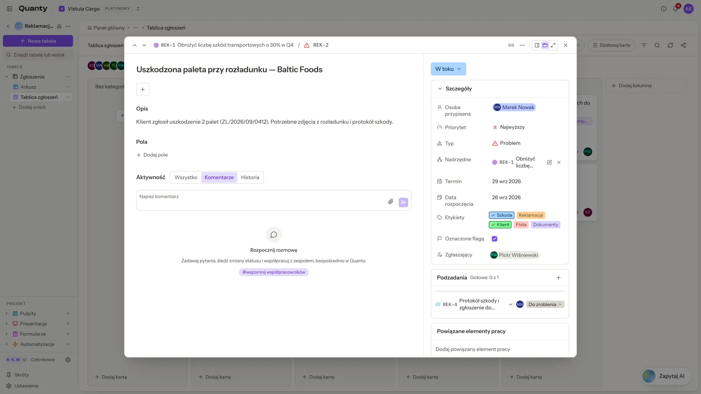
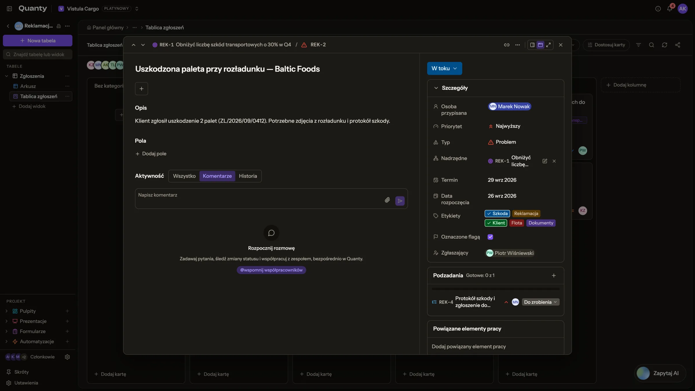
It has three layouts, switched with the buttons in its header: Open as centered modal, Open as side panel and Open full screen. The side panel docks on the right and leaves the board usable, so clicking another card simply swaps the record. Your choice is remembered on this device.
- In the centre is the table's own record: the title, the Description, then every field of the row, editable in place, with Add field to create a real new column without leaving the board. Activity sits below the fields.
- On the right, for a table that tracks work items, are the work details: the status, Details (assignee, priority, type, parent, dates, labels, flag, reporter), Subtasks, Linked work items, and when the record was created and updated. A table without work items gets the full width instead. The side panel stacks everything in one column.
The header shows the key with Copy key, Change type, and an Add menu with Add subtask, Link work item and Attach file. It also has Previous record and Next record, and the Record menu holds Print record, Add record, Copy record URL and Delete record. The open record rides the URL as ?row=, so a copied link or a notification lands directly on it.
Activity and history
Activity has three tabs: All, Comments and History. History lists every change to the row's values: who made it, which field, the old and the new value, and whether it came from an AI run or an Undo. It reads the same trail as Reviews & audit trail. It does not show the values a row was created with, archiving, covers, card order or renamed columns, because none of those change a value.
Comments and @mentions
Each record carries a flat comment thread:
- @mention an organization member and they get a bell notification that deep-links to the record.
- Attach up to 5 files or images per comment.
- Cards show a comment-count badge, so active discussions are visible from the board.
- Ask AI about this thread answers questions over the discussion — "Summarize this discussion", "What are the next steps?" — inline and "Only visible to you"; nothing is saved to the record.
- Members with the Viewer role can read threads but not post.
Filters
Two kinds of filter narrow a board, and they differ in who sees them.
Quick filters
The bar above the lanes is yours alone: "Only you see these quick filters; they stay on this device." Click a person's face to see only their cards (More people lists the rest), or use Only my items and Recently updated, which means changed in the last 7 days. A board that tracks work items adds Type, Priority and Labels pickers, plus Blocked, Flagged, Overdue and Due soon, which means due in the next 7 days and not done. A finished item is never overdue. Clear resets the bar, and the board says how many cards filters hide, with Clear filters next to it.
Saved filter
Filter holds the conditions saved on the board: "Saved on the board: everyone who opens it sees these conditions." It runs server-side over the full row values, on any column of the table, not just the fields shown on cards.
Each condition reads Where field, operator, value, and the operators follow the field:
- Text: contains, does not contain, is, is not, is empty, is not empty.
- Numbers:
=,≠,<,≤,>,≥. Formatted values count as numbers, so "1 200,50 zł" compares as one. - Single select, including status, type and priority: is, is not, is any of, is none of, with the options shown as chips and their icons.
- Multi select, such as labels: has any of, has all of, has none of.
- People: picked from the table's people.
- Checkbox: is checked, is not checked.
- Dates: is, is not, is before, is after, is on or before, is on or after, compared with today, tomorrow, yesterday, an exact date or a number of days from today. is within takes a window that moves with the clock, such as this week, the next 7 days, the past 30 days or a custom number of days, so a filter saved on Monday still means the right thing on Friday.
Combine up to 20 conditions with Add condition and Add condition group, flat or in one level of groups, joined with and or or. A condition that is still missing its value stays on screen but is not applied, and edits apply as you make them.
You can also describe a filter: type what you want into "Describe what you want to see" and hit Build filter — AI turns a description of up to 1,000 characters into a filter over the board's real columns.
The AI filter only proposes
Describe-a-filter never applies anything on its own. It fills the filter panel with the conditions it derived, and you review them and apply — or adjust them first.
Separately, Find cards (⌘F) is an instant, client-side quick find across the cards already on screen.
Boards in chat
Chat carries seven board tools: it can create a board — deterministically, by the same rules as the dialog — read one, update its settings, list the boards you can access, move a card between lanes, add a card, and delete a board, which always asks for your confirmation first. The board you have open registers as chat context, so "move the Acme card to Won on this board" resolves without naming it. On a board that tracks work items, chat cites cards by their key, as links that open the record.
Sharing a board
A board can be published as a read-only link under /shared/ with an unguessable token. The audience is public or organization only — org links require signing in as a member. Visitors see the board but cannot drag cards, comment or open records, and the shared payload strips every internal identifier. The link is revocable at any time, and deleting the board revokes it too: "The board is removed for everyone and its share link stops working. The sheet and its rows stay untouched."
Related pages
- Work items: keys, types, priorities, parents and blockers.
- Columns & AI extraction: the select and classification columns boards stack by.
- Reviews & audit trail: where every card drag is recorded.
- Chat: driving boards conversationally.